Style guide
The warm consumer colour negative look
Droproll Lab · 9 Sept 2026
What the supermarket box of colour film does to yellow, red and blue, why it reads as memory, and the light it needs to work on a phone.
This is the look most people mean when they say a photograph looks like film. Here is what it does to colour, where the recipe came from, and the light it needs to work.
What it is
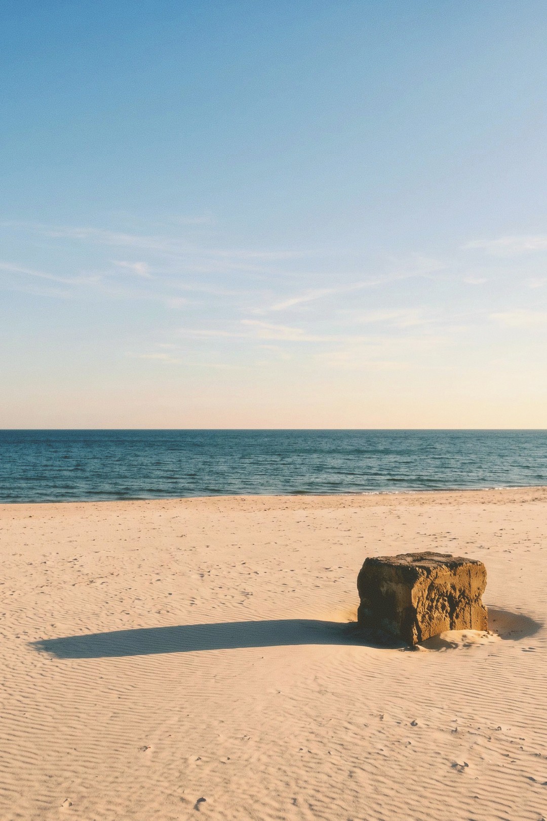
Three things happen at once, and the order matters. The light in the picture turns yellow. Red is left where it is. Blue is kept honest.
Yellow in the light means sunlight, sand, pavement, skin and white shirts all pick up a small amount of warmth. Not orange. A shade closer to butter than to fire. It is the colour a late afternoon already has, applied to the whole frame.
Red left alone is the part people miss. A painted wall, a jacket, a brick front: they stay the red they were. Cheap filters warm the entire picture and drag red towards orange, which is why skin under them looks sunburnt. Here the warmth sits in the light, not in the objects.
Blue kept honest is what stops the picture looking like a filter at all. Sky stays sky. Water stays water. That tension, warm ground against a plain blue top, is most of the look.
Where it comes from
This is not an art film. It is the cheap box of colour negative that sat by the till in supermarkets and chemists, bought by people with simple cameras who were about to go on holiday.
The design brief shows in the film itself. The buyer had no meter and no second chance, so the film had to forgive too much light. The pictures were taken outdoors in summer, so daylight had to look pleasant rather than accurate. The results were printed automatically onto paper at a minilab, so the colours were tuned to please on a print, not to be measured.
That is why the look of Kodak Gold 200, a film sold in exactly that slot since the second half of the 1980s, now reads as memory rather than as a technique. It was aimed at the birthday, the beach, the first day away. A generation of family albums was made on film like it, so the colour and the occasion learned to mean each other.
The film was built to make an ordinary afternoon look like a good one. That was the product.
How to get it at Droproll
Load Aurra 200. It is the film in the app built on this look, and it wants the same light the original box wanted.
Shoot in the last three hours of daylight. Low sun is already yellow, so the film is agreeing with the scene instead of arguing with it. Open shade on a sunny day works, and so does thin cloud. Overhead midday sun is the weakest option: the light is neutral, the warmth has nothing to sit on, and the shadows fall in the wrong places.
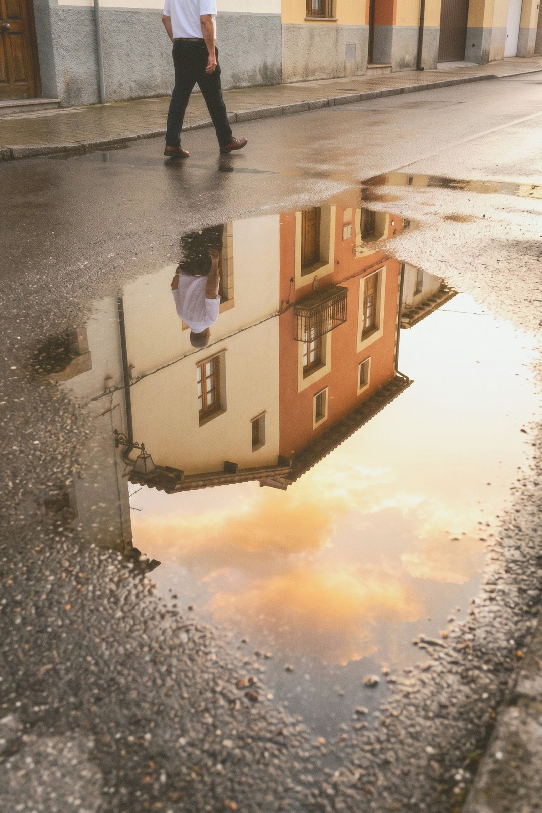
Indoors under white ceiling lights the film has little to work with and the frames come back flat. A window beats any lamp. If you are inside, put your subject beside the glass and turn the room lights off.
Then a few things with the camera.
- Expose for the shadows and let the bright parts go. Colour negative holds highlights well and gives up in the dark, so err towards more light.
- Keep one clean blue in the frame if you can. Sky, water, a painted door. It is what proves the warmth is in the light and not in a preset.
- Point across the sun rather than into it or away from it. Side light keeps texture and still hands you the yellow.
- Give the frame one simple subject. This look is quiet, and a busy scene wastes it.
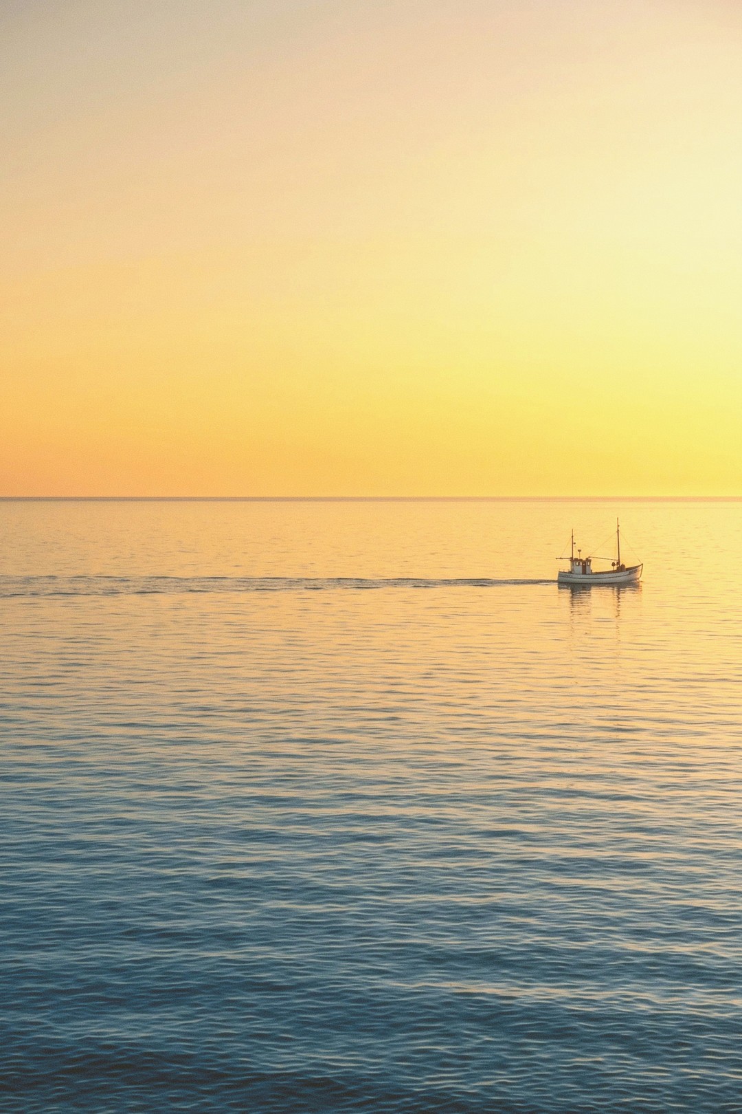
Aurra 200 is a 200 speed film. Once the sun is down you are asking it for more than it has.
What to expect
The roll comes back warm, mild and slightly soft. Contrast is moderate, highlights roll off instead of clipping, shadows go dense and a little brown, and the grain is fine but visible. Skin looks healthy without turning pink or tanned.
What it will not do: it is not a heavy orange and teal grade, and it will not make a grey afternoon interesting. It will not rescue a picture taken under a fluorescent tube. It does not give deep saturated skies, so a bright midday blue comes back paler than your eye saw it. In poor light the frames go thin and grainy.
You also will not know which ones worked until the roll is developed. That suits this look in particular. It was made for the kind of picture you take without thinking about it, and look at later.
Try it
- Aurra 200house filmLoad this film →
- Long Afternoon 400community stockLoad this film →
Also in Style guide
Style guide · 8 Sept 2026
What is the 90s point and shoot flash look
A bright subject, a background that falls away, and a hard shadow on the wall behind. Where the look came from and how to shoot it here.

Style guide · 8 Sept 2026
Pastel portrait film: the look, and how to get it on your phone
Low contrast, light shadows, colour that never shouts. The light that makes a pastel portrait, the film that holds it, and what ruins it.

Style guide · 8 Sept 2026
The disposable camera look, explained
Hard flash, warm colour, soft corners and framing nobody checked. What the look is made of, and how to get it on a roll here.