Style guide
Pastel portrait film: the look, and how to get it on your phone
Droproll Lab · 8 Sept 2026
Low contrast, light shadows, colour that never shouts. The light that makes a pastel portrait, the film that holds it, and what ruins it.
Pastel is not a filter. It is a light, a distance and a film that agrees not to argue with either of them.
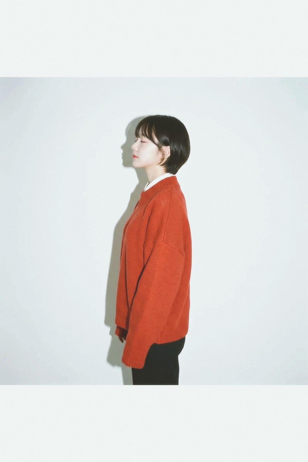
What it is
Four things, and none of them are saturation sliders.
- Low contrast. The darkest thing in the frame is a mid grey, not black. Shadows stay open and you can see into them.
- Highlights that do not clip. A white shirt still has folds in it. The frame gets bright at the top end and then stops climbing.
- Colour a step back. Every hue is present and none of them is loud. Red reads as a warm dusty red rather than a signal.
- Skin held steady. Faces come out slightly warm and even, whatever the wall behind is doing.
Put those together and you get the quality people are actually describing: nothing in the picture is fighting for attention, so the person in it is the only thing to look at.
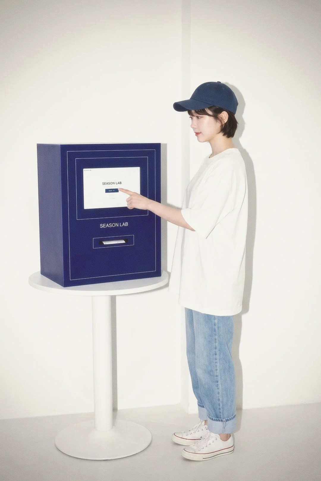
Where it comes from
This is the behaviour of professional portrait colour negative film. That family of stock was built for people who had one chance at a wedding or a sitting: wide latitude, gentle contrast, and skin that survives daylight, a window and a room lamp without turning green or pink.
Colour negative also fails politely at the top. It holds detail well past the point a digital sensor would clip, and it loses shadows first. That is why so many people who shoot it give it more light than the meter asks for. The pastel look is partly just film that was generously exposed and then printed light.
Mira 400 is our take on the look of Kodak Portra 400, and it is where that family of film sits on our shelf.
How to get it at Droproll
The film is the easy half. The light is the half that decides it.
- Shoot in open shade. The shadow side of a building, an awning, a doorway. Soft light from a wide area, no sun on the face.
- Or shoot on an overcast day. A grey sky is the largest soft box you will ever get for free.
- Or use one window. Stand your subject a metre back from it, side on, and do not add a lamp.
- Keep the flash off. Direct flash is a different look, and it is the opposite of this one.
- Move them off strong colour. A red wall two steps behind a face will bounce onto it. A white, cream or pale grey wall keeps skin honest.
- 85mm at f/2.8 for a head and shoulders, 50mm at f/5.6 for a half length. The long lens is where the background falls away.
- Give it light. Pastel comes from a bright, evenly lit scene, not from a dim one. A dark room gets you a moody frame, which is a different picture.
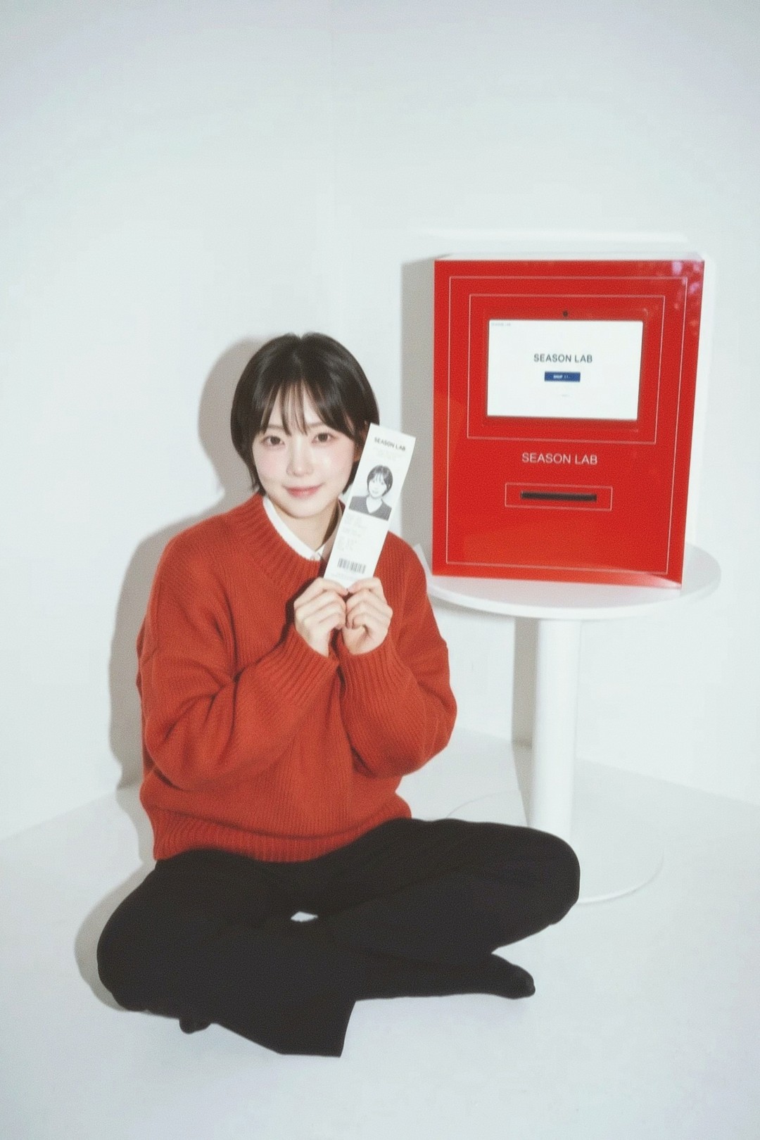
What ruins it
Direct midday sun. It puts a hard shadow under the nose and a bright edge on the cheek, and no film will pull that back into pastel.
Backlight straight into the lens. Every house film here develops with halation at the middle of its dial, so a bright edge picks up a faint red spill. It is a nice effect in the right frame and it is not this frame.
Night. Mira 400 is an ISO 400 stock and the lab draws grain to match. In low light you get texture in the shadows, which reads as atmosphere rather than as pastel.
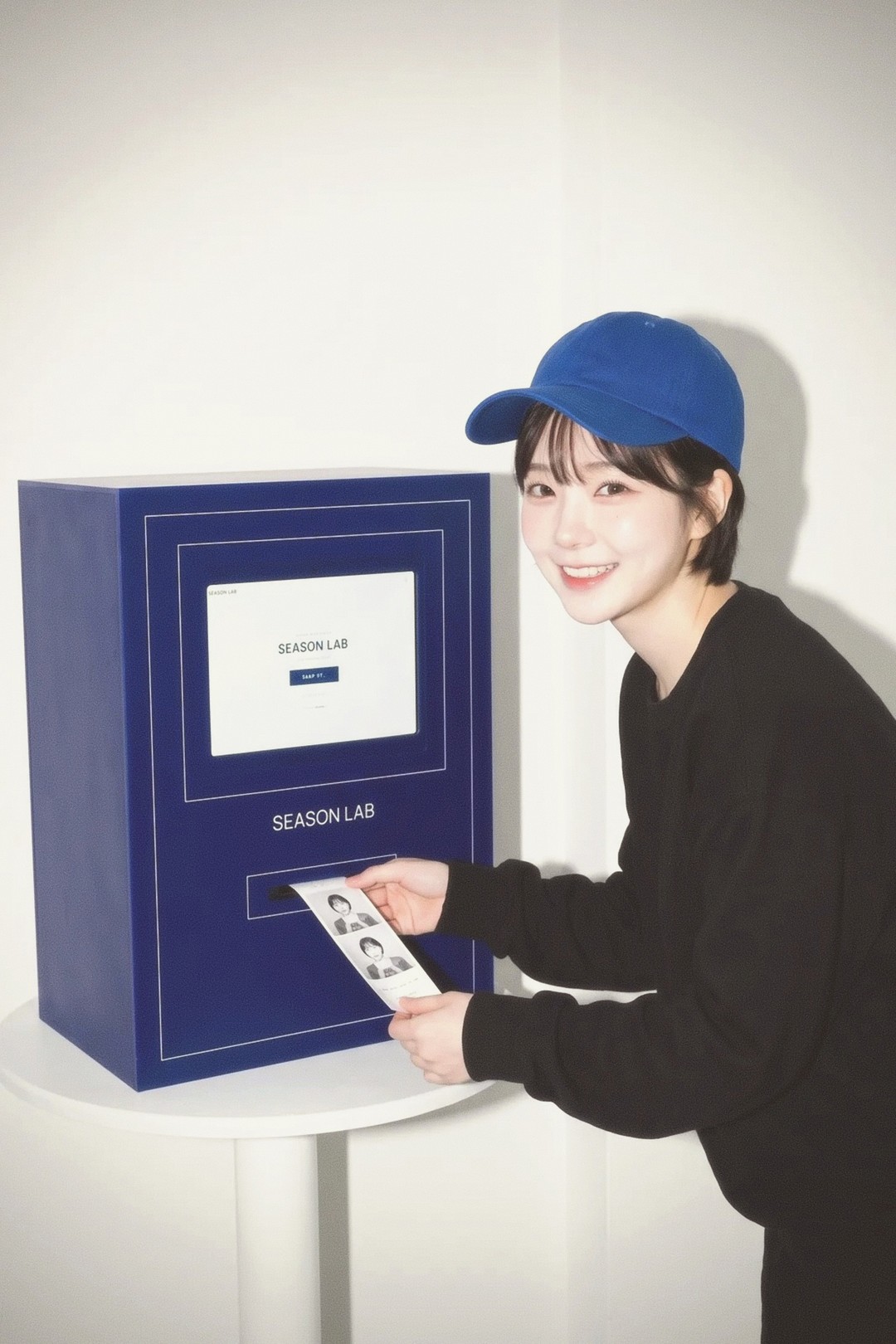
What to expect
When the roll comes back, the good frames will look slightly less contrasty than you remember the scene being. That is correct. If you want them punchier later, that is a crop and a curve away. Going the other direction, from a hard frame to a soft one, is not.
Load Mira 400, find shade, and shoot the same person six times rather than six people once.
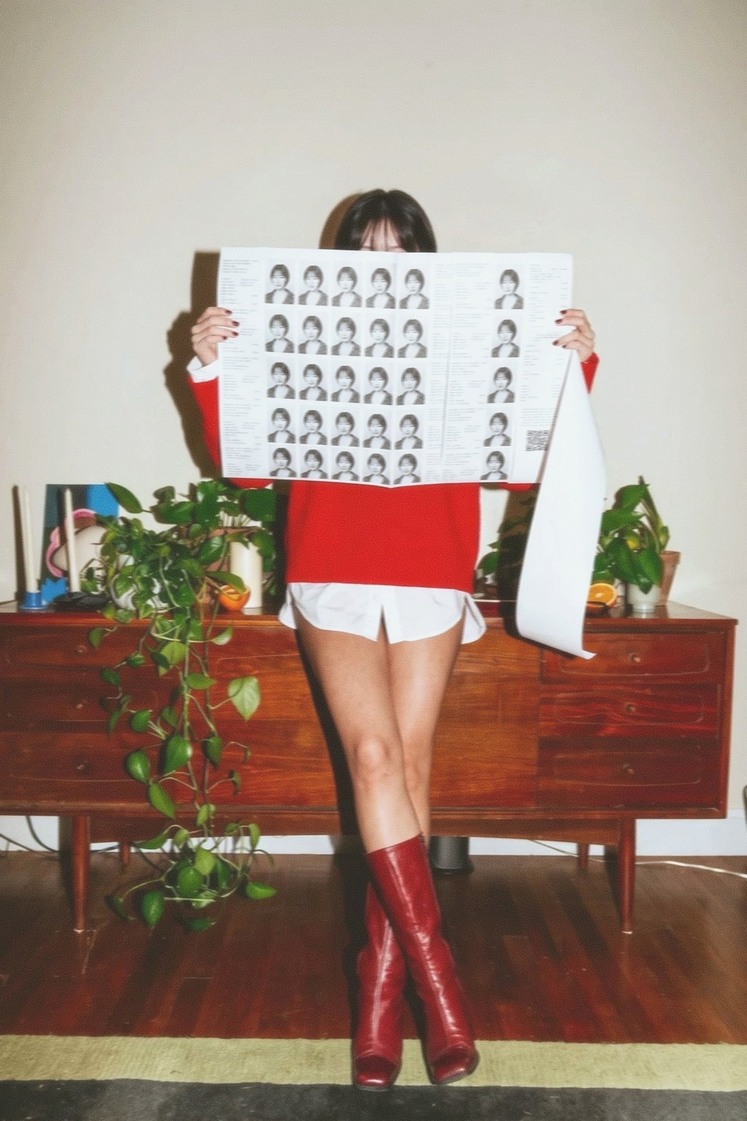
Try it
- Mira 400house filmLoad this film →
- Mira 400 (120)house filmLoad this film →
Also in Style guide
Style guide · 9 Sept 2026
The warm consumer colour negative look
What the supermarket box of colour film does to yellow, red and blue, why it reads as memory, and the light it needs to work on a phone.
Style guide · 8 Sept 2026
What is the 90s point and shoot flash look
A bright subject, a background that falls away, and a hard shadow on the wall behind. Where the look came from and how to shoot it here.
Style guide · 8 Sept 2026
The disposable camera look, explained
Hard flash, warm colour, soft corners and framing nobody checked. What the look is made of, and how to get it on a roll here.